I found this really interesting work by Ben Heine were he combines pencil drawings with real photographs.
Check out his work here
25 Sept 2011
12 Jul 2011
Website
Over the past few weeks i have been putting together my work and making a website.
I have no knowledge on how to make a full scale, proper website; so for the mean time i used wix.com. Maybe in the future i will learn how to make my own website but for now, here it is
Nadine Cargo Website
I have no knowledge on how to make a full scale, proper website; so for the mean time i used wix.com. Maybe in the future i will learn how to make my own website but for now, here it is
Nadine Cargo Website
24 Jun 2011
Final Year Shows
My tutor for my animation module thought it would be a nice idea if people printed out screenshots of their animation so they could be displayed as part of the final year show. We were asked to print out 6 images on mounting board, and here are my images. They printed out a bit darker than i would have liked but i still think they look good.


11 Jun 2011
Cathedral eye clinic animation
Cathedral eye clinic animation is the animation i made for one of the modules in my second semester of Visual Communication.
Its saying that an old tv, video and dvds are not cool, but, HD is cool, but no, not high defination, HD means Healthy Diet! I wanted to try a new approach to any animations that i have done before, so i chose to focus on using typography and simple imagery. I have also stuck to a limited colour palette of oranges/yellows/greys/blacks/browns. I found this animation quite difficult, it was a challenge and i'm happy with the end result!
10 Jun 2011
PANI
Here is some of the work i designed for the NIBTS. Unfortunately we didn't win the pitch, but it was a very close competition! I had a great time working with the CAM students and Mammoth the design agency, and learnt a lot about how real live pitches and campaigns work!


29 May 2011
D&AD
I was browsing through the D&AD website where i found the winners to the Partners Branding brief.
In January, i was part of a group that also did this brief with Northern Ireland Design Alliance.
It was to create a brand for a contemporary art touring gallery in hospitals.
I think the designs here are really good, although some are cheesy like 'Artery, arT, heART' etc
but overall i think they are all really nicely done, the standard is very high!
9 May 2011
PANI
Over the next few weeks i will be taking part in the PANI competition for students at the University of Ulster studying visual communication, communication advertising and marketing or communication advertising.
I have been grouped with 3 viscomers, 2 CA, and 1 CAM which is a nice mix for a team.
We also have the opportunity to work with a design agency and we have been paired with Mammoth design, in Belfast.
Here is a link to their work
http://www.mammoth.tv/page/our_work
Our project aim is to create a new advertising campaign for the Northern Ireland Blood Transfusion Service and i am looking forward to getting started!
17 Apr 2011
Contemporary Souvenir
Our final project for Design and Corporate Advertising was to brand an up and coming company called 'Contemporary Souvenir' within this we had to either, brand the company with a logo, copy, imagery, tagline or design advertisements, or design packaging.
I decided to look into all of these but mainly focus on the branding of the company.
My idea was based on the fact that souvenirs are objects that people buy from our culture to take back to theres.
My tagline was 'Bring a piece of our home, back to yours'
My main imagery was then the biggest tourist areas in Northern Ireland including, the giants causeway, Titanic quarter, Mourne mountains.
My main logo was a hexagon shape to represent a 'piece' which is what a souvenir is.
The typography in the logo is bold, modern, interesting, intriguing, all of which are included in the brand values of contemporary souvenir.
I also narrowed it down to C.S, to make it even more modern and appealing.
Here is some of the work i designed for the CS


4 Apr 2011
Essay- Are billboards an effective form of OOH advertising?
essay is finally complete!!!!
'Are billboards an effective form of OOH advertising?' (Out-of home)
prototype of what the final piece will look like when i print it tomorrow!


'Are billboards an effective form of OOH advertising?' (Out-of home)
prototype of what the final piece will look like when i print it tomorrow!


Change my mind: Fountain pen
The brief for this project was to take a product or service, and advertise it in a new way that would 'change someones mind'
After many product changes from a pacifier, to shower seat to a granny's trolley i decided to go with a Fountain pen.
I chose a fountain pen because it is mainly used by old, business type people, or used for special occasions like invitations etc. I wanted to re brand the fountain pen to make it a useful tool for teenagers aged 10-16 as a way for them to express themselves. Using a fountain pen to splurge their thoughts onto a page.
A fountain pen is the perfect method to do this because it is more smooth and free flowing that any other pen.
here are my designs for my advertising campaign.


10 Mar 2011


27 Feb 2011
Semester 2- Children's Book
For our Narrative and Motion Design module we were asked to complete the Puffin digital book prize brief and create a young children's book for an Ipad. My story is based on teaching children about main colours- red, blue, yellow and green and is based around a cat called Moby. My story is called 'Messy Paws' because this little cat gets very messy as he tries to learn about colours.
I was influenced by Paul Rands simple bold shapes and colours and textures and Oliver Jeffers use of type. Once we had our storyboards finished we had to add a button to flick through each page. I made my button a hand painted paw that i scanned in. I also added a cat noise to give an extra layer to my story.
This is the final story, which i am quite proud of.
Click Messy Paws and press the paw to go to each page!


Click Messy Paws and press the paw to go to each page!


Semester 2- Poster design
This is my final poster design for Design and corporate advertising module. We were asked to pick a quote and design a poster based on it, taking influence from other designers.
My quote was 'In the past we branded slaves. Now we are slaves to brands' by Jonathan Barnbrook. Within my poster i then took the idea of people wanting to have/be a brand, but in the past, being branded was a bad thing. So i have used the shackles as a metaphor for slavery and bracelets/gold/brands. There is also a small dollar sign which stands for 'sale' and 'slavery' The typography is laid out to look like a stamp because in the past, slaves would have had a metaphorical stamp over their head to be branded as such. I have taken influence from Saul Bass's work in my design, and the brown background and choice of typography i feel, reflects slave imagery that i researched.

Semester 2
This week we had two hand ins for the two modules we are doing this semester.
One was for a Narrative and Motion design module which was to create a children's story book for the Puffin digital book prize, the other was for Design and Corporate advertising module which was to pick a designer quote and design a poster which expresses it. I really enjoyed both of these modules and the outcomes of each.
I will post the final designs on my next blog.
16 Jan 2011
Design Alliance
I am currently taking part in a Design Alliance competition. This year, the competition asks for us to create a brand for a touring art gallery for hospitals. We have to consider a logo, typeface, colour palette and more to make it a success. It has to be appropriate to all people in the hospital including patients, staff, visitors as well local and national press. It is a group project and there is a total of four members in the group.
Here is the link to the Design Alliance in Northern Ireland-
http://www.nidesignalliance.com/
Each group was given a design company to work with and our design company is Slater Design, from Holywood.
Here is a link to there site. http://www.slaterdesign.co.uk/
Here is the link to the Design Alliance in Northern Ireland-
http://www.nidesignalliance.com/
Each group was given a design company to work with and our design company is Slater Design, from Holywood.
Here is a link to there site. http://www.slaterdesign.co.uk/
Photo Essay
For our Imaging2 module we were asked to create a photo essay (slideshow) with a theme running through out. My final idea was based around the destruction of nature. It started with focusing on how many gates, fences, wire, locks etc were in a forest area. I then found a lot of trees and fences with paint on them which made for interesting photos. Here are some of the images from my photo essay.


5 Dec 2010
1 Dec 2010
Advertisements
Today we went round the university and displayed our posters for our exhibition. Here is us putting them up


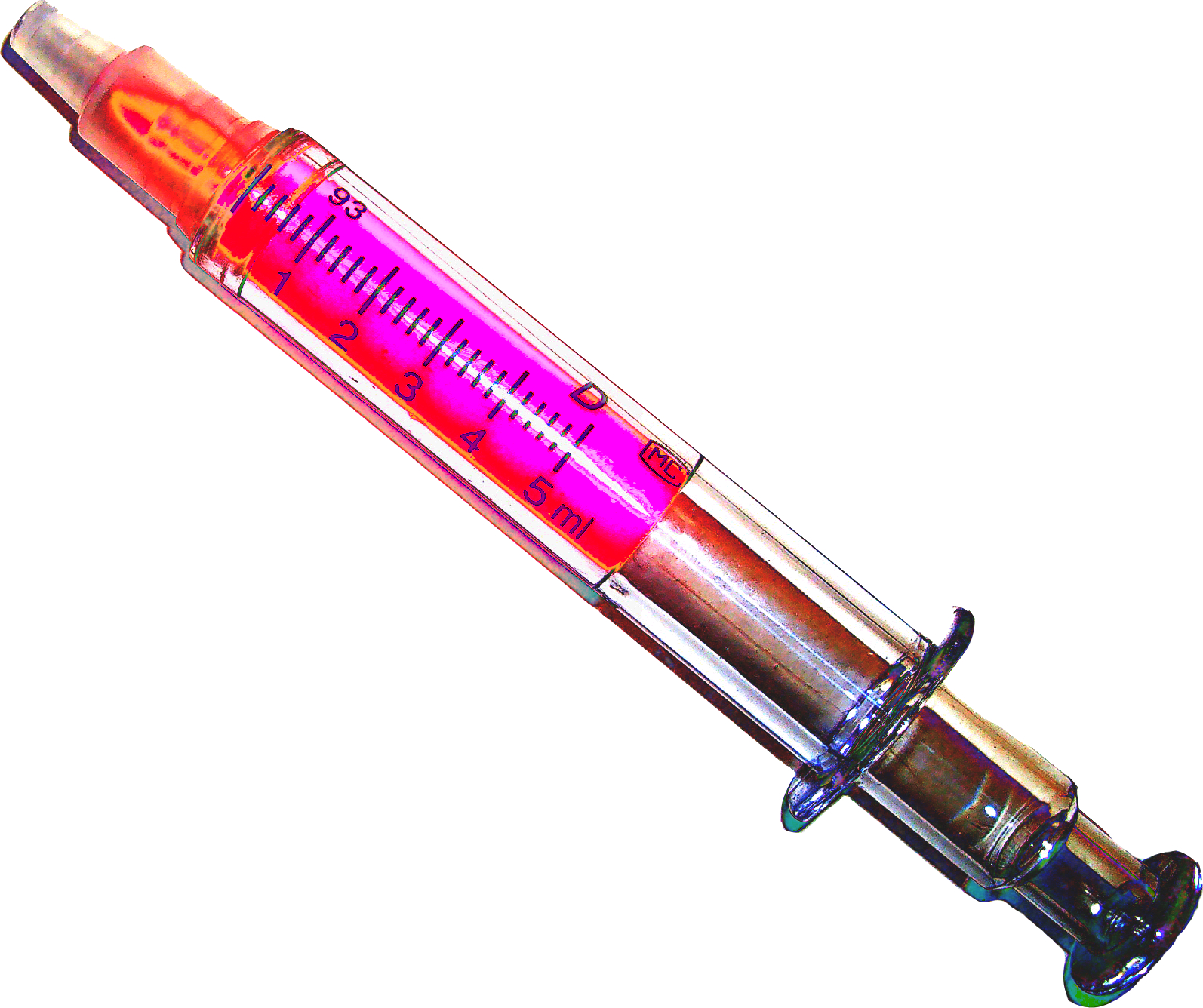
This is an a3 syringe idea that i might then place onto an a3 card and use it as a poster.


Hand made ideas
Here is some hand made ideas for posters and flyers that i did today. I think they work well and may be considered for our final exhibiton.


Subscribe to:
Posts (Atom)